

Design & UX · ViewMatrix Digital
Why design comes before development
Design is where a project's structure gets decided, and where mistakes are cheapest to fix. This page explains what UI/UX design involves, why prototypes are used, and how the decisions made here carry through to development and maintenance.
Two jobs, two timings
UI and UX are different jobs
Both matter, but they are addressed at different points in a project. UX decisions come first, usually as wireframes. UI decisions follow, once the structure is settled. Mixing them too early makes feedback harder, because reviewers end up commenting on styling while the underlying flow still needs work.
How a product works
The flow between screens, the steps in a process, and what happens when something goes wrong. UX work answers what a visitor is trying to do and what the product should do next.
- Screen order and navigation paths
- What each form asks for, and in what order
- Error, empty, and loading states
How it looks and feels
Layout, type, spacing, colour, and interactive states. UI work answers how the product presents itself, and how it responds when someone touches it.
- Grid, spacing, and type scale
- Button, field, and hover behaviour
- Visual consistency across screens

Before any styling
Wireframes: structure without styling
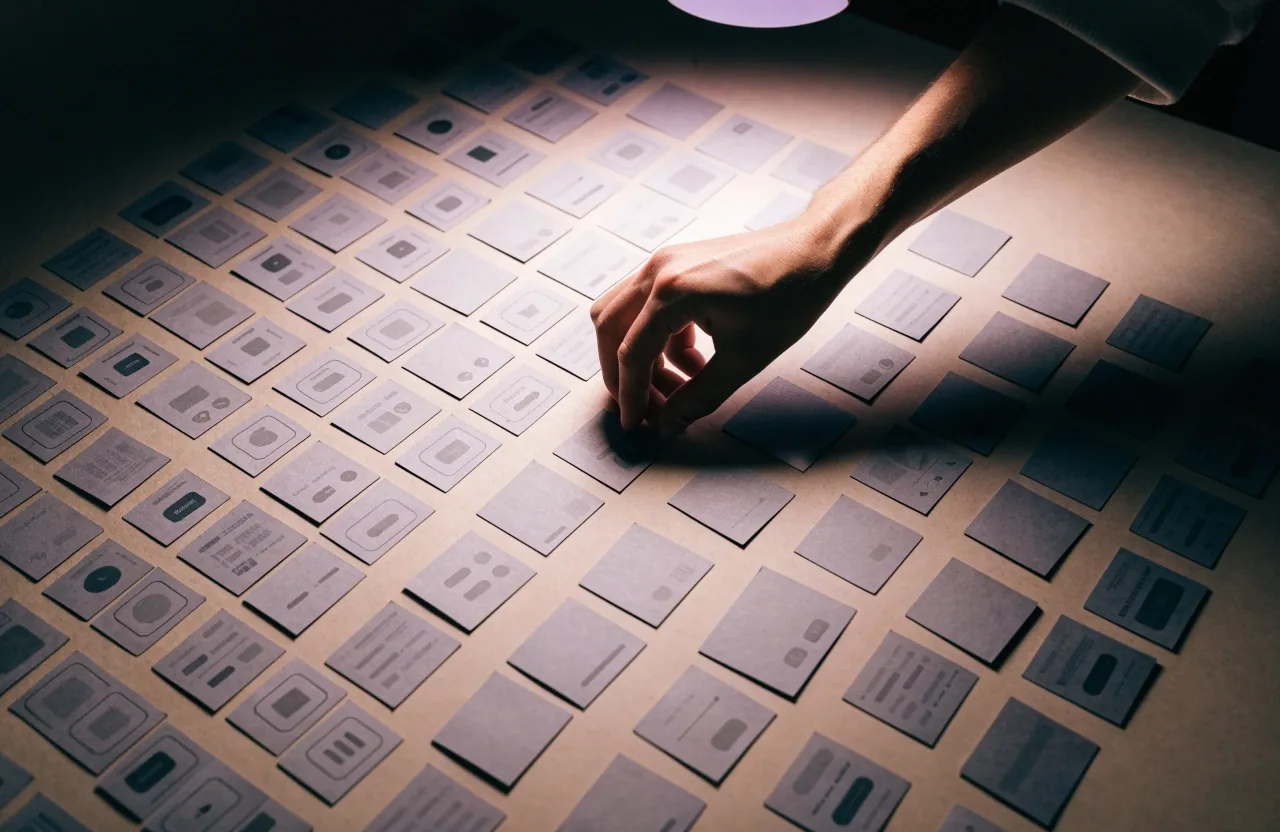
A wireframe is a simple layout showing where content, controls, and navigation sit. It is deliberately plain, so attention stays on structure rather than visual style. Clients can mark up a wireframe to say that a button needs to sit higher, or that certain fields should be grouped together, without getting pulled into a debate about colour.
Wireframes are quick to produce and quick to change. A set of wireframes for a small business website might take a few days; a complex web app takes longer, because there are more flows to map and more edge cases to describe.
What a wireframe shows
Page sections, navigation, buttons, form fields, and where each piece of content belongs. No colour decisions yet.
How clients use them
By annotating directly on the page: move this, group that, add a step here. Feedback stays concrete instead of turning into taste arguments.
Why they save time
Moving a block in a wireframe costs minutes. Moving the same block after development costs days, because code, content, and testing all shift with it.
Prototypes: testing a flow
A prototype adds interactivity to the design. In a tool such as Figma, screens can be connected so a reviewer clicks through a booking flow or a sign-up sequence as if it were already built. Problems surface early: a missing confirmation step, a form that asks for the same information twice, or a path that has no clear way back.
Prototypes are also useful for internal testing. Showing a flow to the staff who will use it daily often reveals issues that a design review alone will not, because they bring the real cases they handle every week.
Connect the screens
Link each step so a reviewer can move through the sequence with a click, the way a visitor would.
Walk it with real cases
Test the flow with the everyday scenarios the team handles, including the awkward ones, not just the happy path.
Record what breaks
Note the gaps before development starts, so the fix happens in the design file rather than in the code.
A design system is the set of rules that keeps a growing product from drifting apart.
Buttons, fields, cards, headers, and the rules for using them. The point is not tidiness for its own sake. It is that the tenth screen costs less than the first, and that the product still looks like one product after a year of additions.
Consistency that scales
Design systems and consistency
A design system is a set of reusable components: buttons, form fields, cards, headers, and the rules for using them. It keeps a site or app consistent as it grows, and it speeds up later work because new screens are assembled from parts that already exist and have already been reviewed.
The value depends on how far a project is expected to go. A five-page brochure site may not need one. A customer portal with dozens of screens almost certainly does.
Small brochure site
A handful of pages with stable content. Shared stylesheets and a short set of layout rules are usually enough; a formal system is optional.
Growing marketing site
New campaign pages appear every month. A small component library keeps them consistent and keeps each new page quick to assemble.
Web app or customer portal
Dozens of screens, repeated patterns, and a team of more than one. A documented system is what keeps the product coherent over time.

Start from the smallest screen
Responsive design as a first step
Responsive design means the layout adapts to different screen sizes. It is not a final adjustment. If a design is drawn only at desktop width, the small-screen version becomes a series of compromises later.
Design for the smallest screen you expect to support, then expand. Check how forms behave on a phone, how tables reflow, and whether navigation stays usable with one hand. In Singapore, where a large share of visitors arrive on mobile, this affects whether people complete the actions you care about.
Form fields that stay usable with one thumb and a short attention span.
Tables and comparison blocks that reflow into readable rows rather than shrinking.
Navigation that remains reachable when the phone is held in one hand.
Decided in design, not after
Accessibility and why it matters
Accessibility covers making a site usable for people with visual, motor, or cognitive impairments. In practice it means readable contrast, keyboard navigation, labels on form fields, and text alternatives for images. It is also a legal consideration in some jurisdictions, and it tends to improve usability for everyone, not only for the people it is meant to protect.
Decisions made during design determine most of this. Retrofitting accessibility into a finished build is more expensive than designing for it from the start, because by then the layout, the components, and the content structure are already fixed.
Readable contrast
Text and controls that stay legible against their backgrounds, including in bright outdoor light.
Keyboard navigation
Every control reachable and visible by keyboard, with a clear focus state along the way.
Field labels
Forms that say what they want, in plain words, instead of relying on placeholder text that disappears.
Image alternatives
Descriptions for meaningful images, so the page still works when the picture does not load or cannot be seen.

Design becomes development work
Handoff to development
Handoff is the point where design becomes development work. A good handoff includes the prototype, the component library, and notes on behaviour: what happens on hover, how errors are shown, and what the loading state looks like. Figma files support this by letting developers inspect spacing and states directly, rather than measuring from a screenshot.
Weak handoffs are a common source of rework. When developers have to guess at intended behaviour, they usually guess differently from the designer, and the difference only shows up once the feature is built.
Design and maintenance
Design work does not stop at launch. New pages, campaigns, and features should follow the same components and rules, or the product drifts into inconsistency that is hard to unwind later.
Keeping the design system updated is part of maintenance, and it is worth agreeing who owns it once the original team steps back.
What usually needs an owner after launch
Built from existing components, so a campaign page does not quietly introduce a second set of styles.
A button change made in one place should reach every screen, including the ones added after launch.
Short written rules for when to use each component, kept where the team will actually find them.
A light review step before new screens ship, so consistency is checked while it is still cheap to fix.
Common questions
Questions people ask before design starts
Short answers to the things that come up most often in the first conversations about a website or mobile app project.
How long does the design stage usually take?
It depends on how many flows the product has. A small brochure site with a handful of pages is usually measured in days. A web app or customer portal with dozens of screens takes considerably longer, because each flow needs mapping, review, and a decision on edge cases before development can start.
Can we skip wireframes and go straight to visuals?
It is possible, but it usually costs more later. Reviewers tend to comment on styling while the structure underneath is still unsettled, and the structural changes then have to be applied to finished-looking screens. Wireframes keep those two conversations apart.
Do we need a full design system for a small site?
Usually not. A short set of layout rules and shared stylesheets are enough for a handful of stable pages. A documented component library starts to pay for itself when new screens appear regularly, or when more than one person is building them.
How does responsive design affect the schedule?
When small screens are designed first, the desktop version is usually an expansion of a layout that already works. When small screens are left until the end, the work becomes a set of fixes applied to a finished design, which takes longer and often produces a weaker result on phones.
Who owns the design files after the project ends?
This is worth agreeing at the start rather than at handover. Most projects are simpler to maintain when the client holds the design files and the component library, with the original team available for updates when they are needed.

If design work is part of your next project
The usual first step is a short conversation about what the product needs to do, who will use it, and how far it is expected to grow. From there, wireframes and a prototype are enough to agree on structure before any code is written. If you would like to talk through a specific project, the contact page has the details.
ViewMatrix Digital, Calle Esmeralda 1025, 2340000 Valparaíso, Región Metropolitana, Chile. Monday to Friday, 9:00 AM – 6:00 PM.